Best Glazed Tile
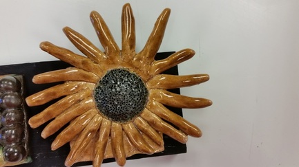
This tile is meant to resemble a sunflower, but with a more subtle color scheme.
The petals are meant to be a more neutral yellow or brown tone in order to emphasis
the center of the flower. The circles that are in the center of the flower add texture
and detail in order to give the flower more life. I think this tile is glazed the best
because it features different colors that draw attention to the center of the flower.
Also, the use of the glaze on the petals contained small specs that helped give
the flower more character. If I had to do this project again, I would take more
time deciding exactly what type of design my tiles would have and also, I
would experiment with mixing colors more, instead of sticking to the basic colors.
Favorite Tile
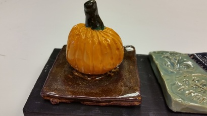
This tile is made to resemble a pumpkin that is embedded in soil. I decided to create
this tile because it went along with the time of the year perfectly. The use of lines on the
pumpkin adds texture other than the smooth texture that was already present. By placing
the bright orange between two dark colors, it creates balance throughout the work. This tile
is my favorite because it reminds me of fall and carving pumpkins with my family. It's a
classic design that I think will never go out of style. I thought I was pretty successful in
completing this project. Everything didn't go as I planned, but I was able to make things
work and do the best I could.
